I'm a big fan of Solarized Dark color scheme and have been rigorously applying it to every application that allows changing colors. After using the color scheme for many years, these colors feel very calming to me.
That's not to say I find it perfect. Things I don't quite like:
I've decided to create my own color scheme that will address all of these issues.
I recognize that it will likely feel unbalanced for anyone who doesn't have the same color perception peculiarities that I have. That's okay! It's not my goal to make it good for anyone except me.
I'm targeting terminal and the overall shape will be similar to Solarized:
Following the ANSI standard, 16 terminal colors have predefined meaning: black, red, green, yellow, blue, purple, cyan, white, and the "bright" versions of the same 8 colors. This makes for 4 "atonal" (2 versions of black and white) and the rest 12 "tonal" colors. It's unfortunate that we'll stray away from the standard, but it's a good guidance for what tones to choose in the color scheme.
Here is a brief introduction to ANSI colors and guide how to not stray from the standard.
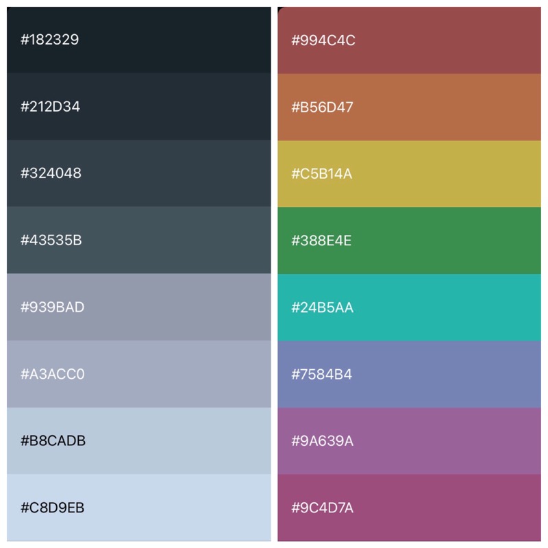
I found some free app that allows creating 8-color palettes and allows manipulating colors in HSB space. That's good enough! I think Coolors would work fine too:
The palette must strive to be "balanced":
Solarized palette uses L* values from CIELAB color representation to ensure contrast between "atonal" and equality between "tonal" colors. I've balanced by eye. CIELAB attempts to objectively measure colors while my retinas lack in perception of red shades (and probably many more smaller disproportions).
I did few iterations after the initial colors were all chosen. First the background was still too blue. Then I've noticed that cyan is almost indistinguishable from the whites. I've made it a bit more emmm "turquoise"?.
I'm pretty sure there is more to refine after I'll use it daily for some time.

Next I'm going to apply these colors to all the applications I use.
2022-01-02 | #colorscheme #design
Agent Parsley